The ordering experience
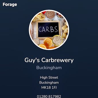
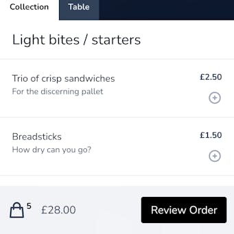
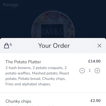
One of the benefits of Forage is that it’s built as a web app and doesn’t require the user to download anything from an app store to use it.
As well as ensuring it was super mobile friendly, we were keen to make it feel like a native app experience as much as possible. We used some of the latest UI techniques for doing this, including subtle animations and touch events.
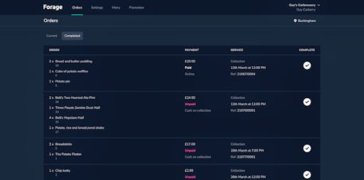
Order management
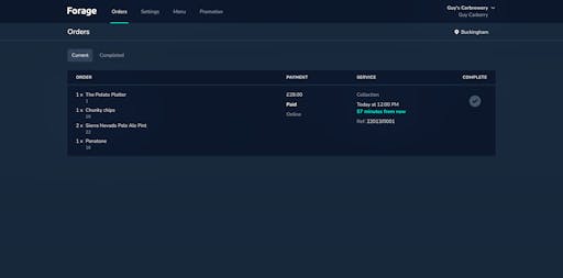
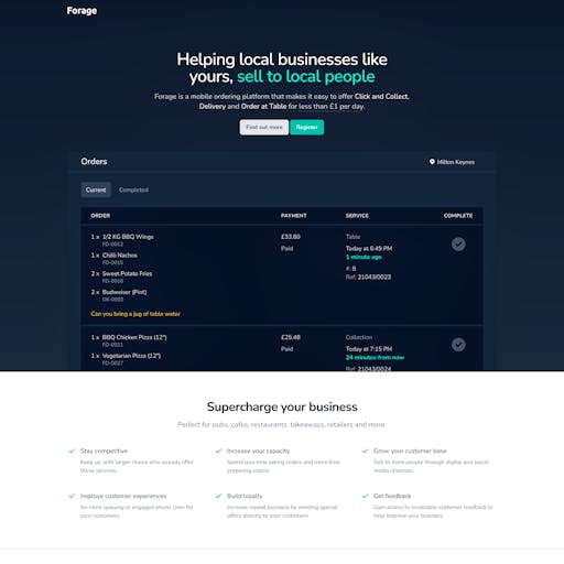
Order screens need to be practical, so we focussed on small enhancements to help optimise the user experience. For example, we used relative times, like “57 minutes from now”, so that staff could see at a glance when an order was due. We also listed orders by priority and made it really easy to hide them from the main screen once they had been completed.
We opted for a dark theme to reduce light pollution and screen burn-in since the screens would likely be on for long periods of time.
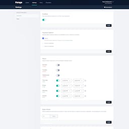
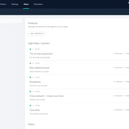
Settings and menus
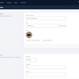
Configuring things like the opening hours, the menus and the payment options needed to be simple and intuitive, since it was most likely to be business owners who’d be setting it up.
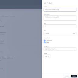
The use of dynamic components like slide-in panels and drag & drop lists allows users to edit things within the context they are displayed, making for a quicker, easier and more intuitive experience.
Marketing website
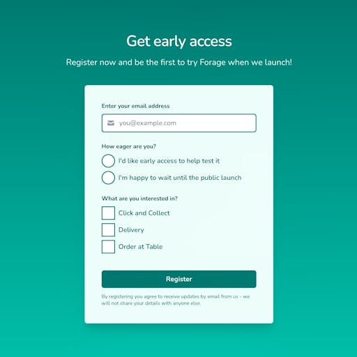
And finally, we built a website to help promote Forage and onboard early adopters.
Fancy a chat?
Sometimes it’s just useful to talk things through with someone who’s seen similar situations before.
No pitch, just a conversation. We’ll talk things through and see where we can help.
